This stuff was for some pretty big names : Coca-Cola®, Starbucks®, Desani®, Sprite®, President’s Choice®, and at this time I don’t recall who the Salsa Bowl was for. This is part of my regular day job as a graphic designer. I am sometimes tasked with Illustration, 3D rendering flat box packaging that I have mocked up, photo retouching, page layout, and branding.
All of this stuff was from 2017, so it has gone to market and they have moved on to new promotions and this isn’t spilling any trade secrets by showing it off here. The agency’s may have made some other tweaks to these items after I hand them off, I have no control over that. I’m not certain if these items made it to market “exactly” as I left them, but I put my fingers in that pie, and felt like showing some of it off. It seemed as though all I was posting was my personal sculpture work, and not any real paying “Day Job” type stuff.
In no particular order:
Affogato coffee press_header cardIced coffee glass_cleaned up
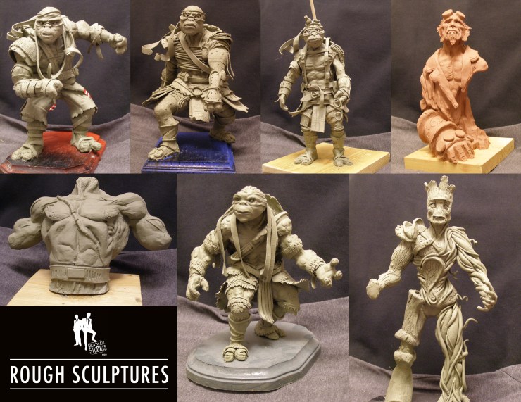
The first nine items I’ve sculpted this year. Have started to see a plateau, and even a regression in some elements, so I’ll have to work diligently to correct those mistakes, and find some new perspective to tackle these pieces from. No point working harder and doing the same thing, time to take in some new technical lessons and work smarter. I have the shelf space for around 35 more on the two remaining shelves I have open in my office. Best be making the most of it!
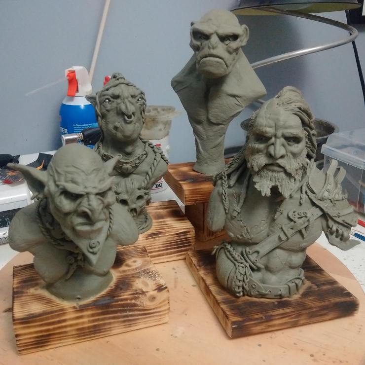
This has been a really solid year for me as far as creative output is concerned. I have just completed my twelfth sculpture of 2017. The last four items have been busts about 5″ – 6″ in height, so they use less material, and allow me to focus on details and the anatomy of the head / facial features. Not going to lie, that is a real weakness of mine, but I’m trying to tackle it head on, and have been reading up on it, and watching tutorials, and having a real great time exploring other sculptors works for inspiration. It has been a really great hands on experience. I do love the graphic design work that I do, but this just seems to be more visceral. The fewer successes I have early on in the process, the happier I am towards the end with the final product; usually. Means I’ve had to tear off and rework areas again, and again in order to get it to look like the reference materials. It helps when the reference materials I have been using are these fantastic pieces done by Giorgos Tsougkouzidis. All bar three of this years sculpts have been sight copies or have been based upon artwork done by some on else.
The reference sheet for the Barbarian done by Giorgos T.The last four busts grouped together.
As you can see from the reference material, I got close, but i have no where near the same skill as the original sculptor. Gives me a tough space to aim for over the next few years.
As promised, here is the updated group shot of all of this years sculptures. Some good, some bad, a couple that test out new substrates (Super Sculpey®). Mixed media used in a couple, with fabric, and wooden dowels, wire and such. More than double the amount of work than I have ever put out in a single calendar year. Moving along nicely. All but one of these are copies of other amazing artists work, so you should go check out, Sideshow Toys, Cyril Roquelaine, Giorgos Tsougkouzidis, David Lemon & Julian Khor.
All ten sculptures that I have completed this calendar year.
Greatwall Studios is a boutique design studio that works with medium to small sized companies across Canada. There are more design firms than I would care to count, so how do we add value to you as the consumer, along with our top notch service? Well, I’ll let you know. Up front, we’ll break down how the process is likely to unfold, and when and where and in what format you can, should or will be required to provide feedback.
A case in point for anyone looking for a logo for a start-up or a mom & pop type business. The first steps we’ll ask you to do is find logos that you are drawn too. Look at other logos that relate to your business, look for any trends or reoccurring graphics & icons. Take some time to think about the colour scheme, as this logo will eventually find its way onto everything. If it is only going to go on a business card, there is minimal risk in having to reprint 1000 business cards if you go off of the design in a year, but if it is going onto uniforms, labels, packaging, vehicle wraps, the side of your building then you absolutely must be certain of the colours you’ve chosen.
Once you’ve done those things, then we would have a meeting and we would discuss the next steps. Discussions regarding your audience or any key demographics you wish to high light or are wary to alienate. We’ll discuss logos that you do like, things that you hate, what makes your company different, what sets you apart. We’ll build a strategy for a collaborative creation of your brands logo.
Then we hit the pavement and do some research of our own. Then comes the thumbnail sketches, where we just play with themes, positioning, font choices, layout, colour and composition are really taken for a spin as we tackle the solution from every angle we can think of. Those thumbnails get narrowed down to a solid set of 7-10 ideas which then get fleshed out in greater detail. This leads to our first round of review. A good rule of thumb to keep in mind is that most agencies will include **3 rounds in the price tag, and anything outside of that and you’ll begin to pay for overages, that will quickly **double if not **triple the original price (Not always the case, but it has been known to happen). This is where you get to hold the designs in your hand for the first time, and really should take a few days to mull things over. Look at what you do like, make notes of it, look at what you don’t like, make notes of that too. But explain it in terms of:
• Colour choices • Icons • Layout • Composition • Fonts & Typefaces • Size of elements contained within design • Is it too minimalist vs. Too busy • Is it cliché • Too similar to something you think you recognize from somewhere else?
These are criticisms that are easily deciphered and can be corrected with ease. Coming back with statements like “I don’t know, it just isn’t working for me. Or, Seems off, it’s weird.” Are comments and criticisms that will cause you aggravation because they don’t identify any portion of the design, and are wholly subjective to you.
So you’ve had a good look at the designs, you and your team have looked them over and argued for and against certain designs. Now you deliver to us your review notes, typed out alongside the logo options, and discussed in person.
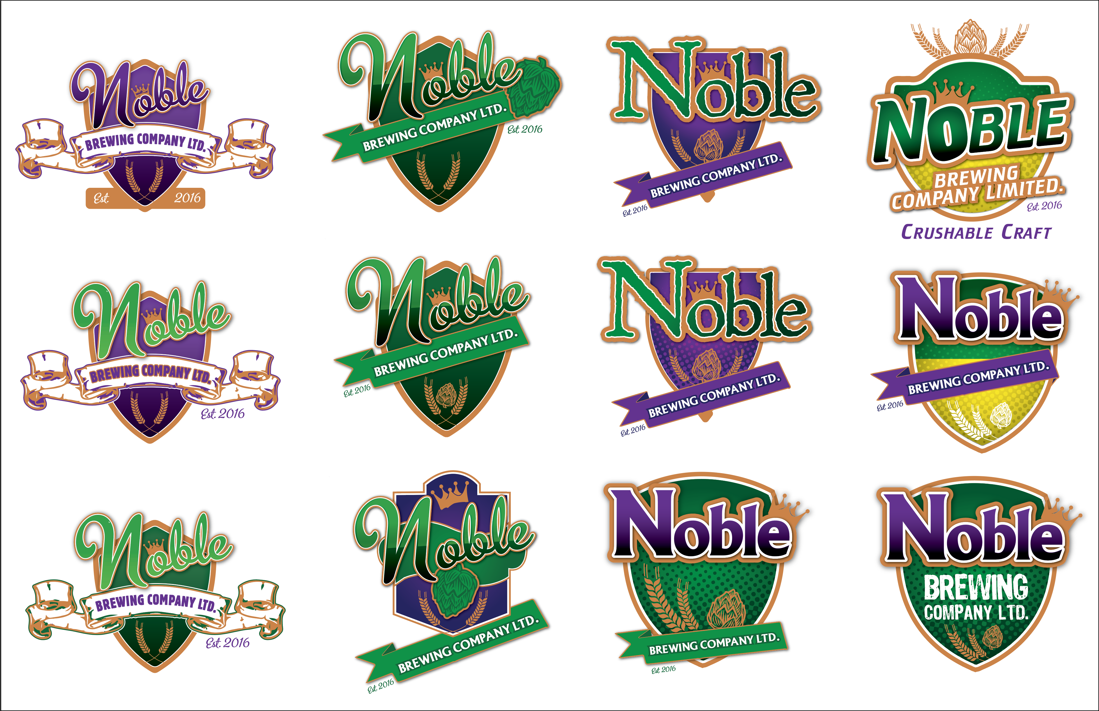
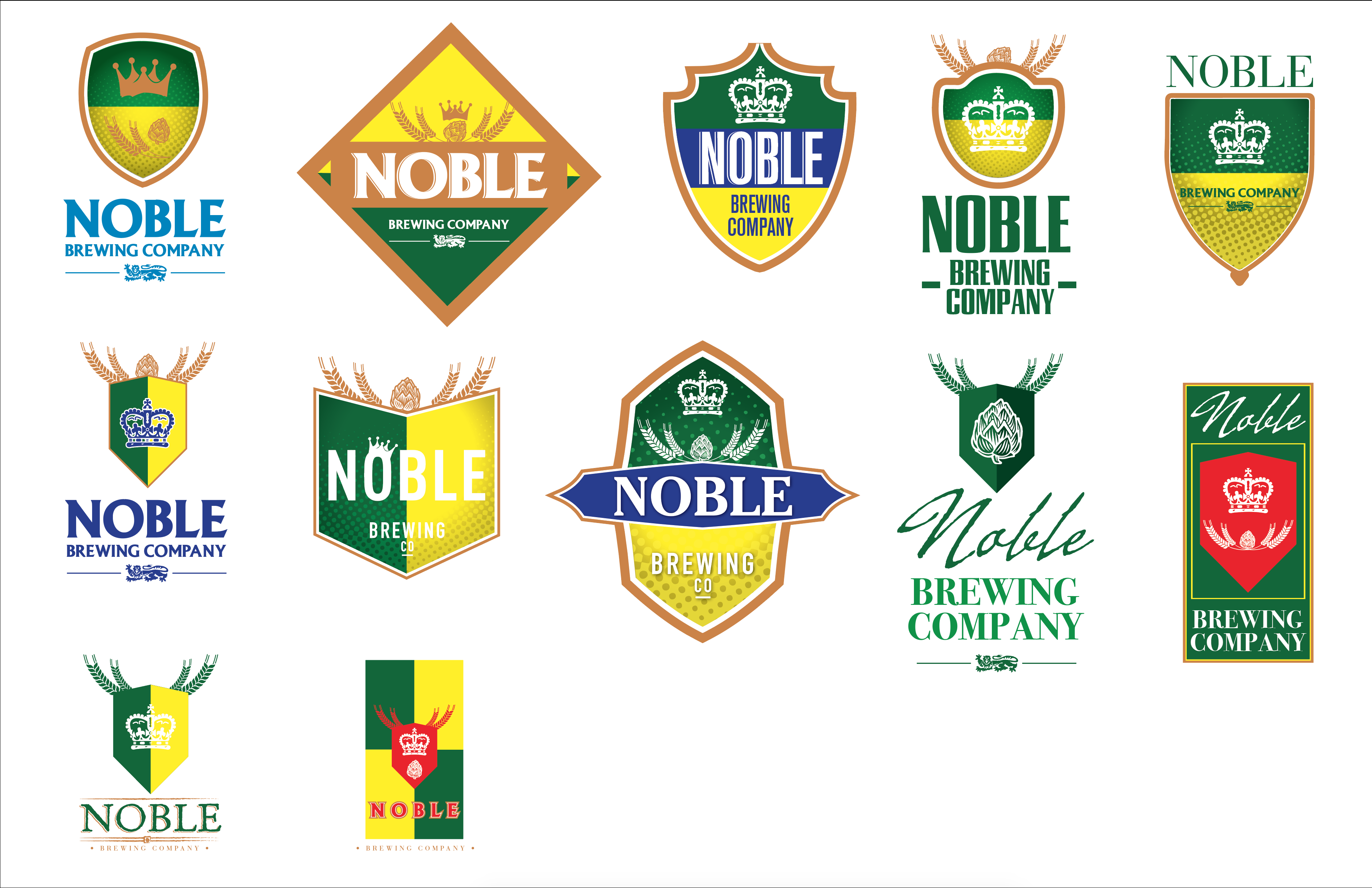
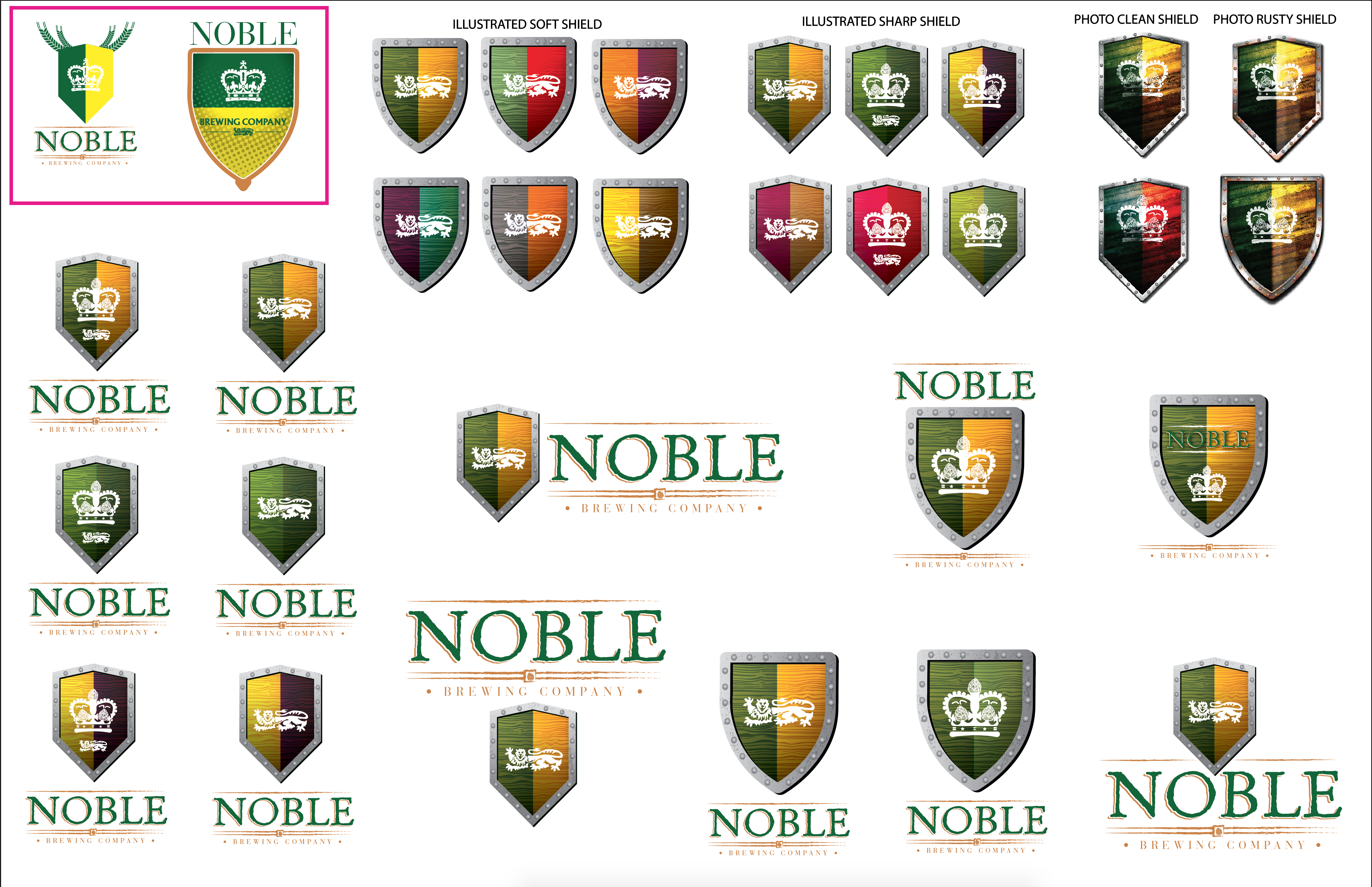
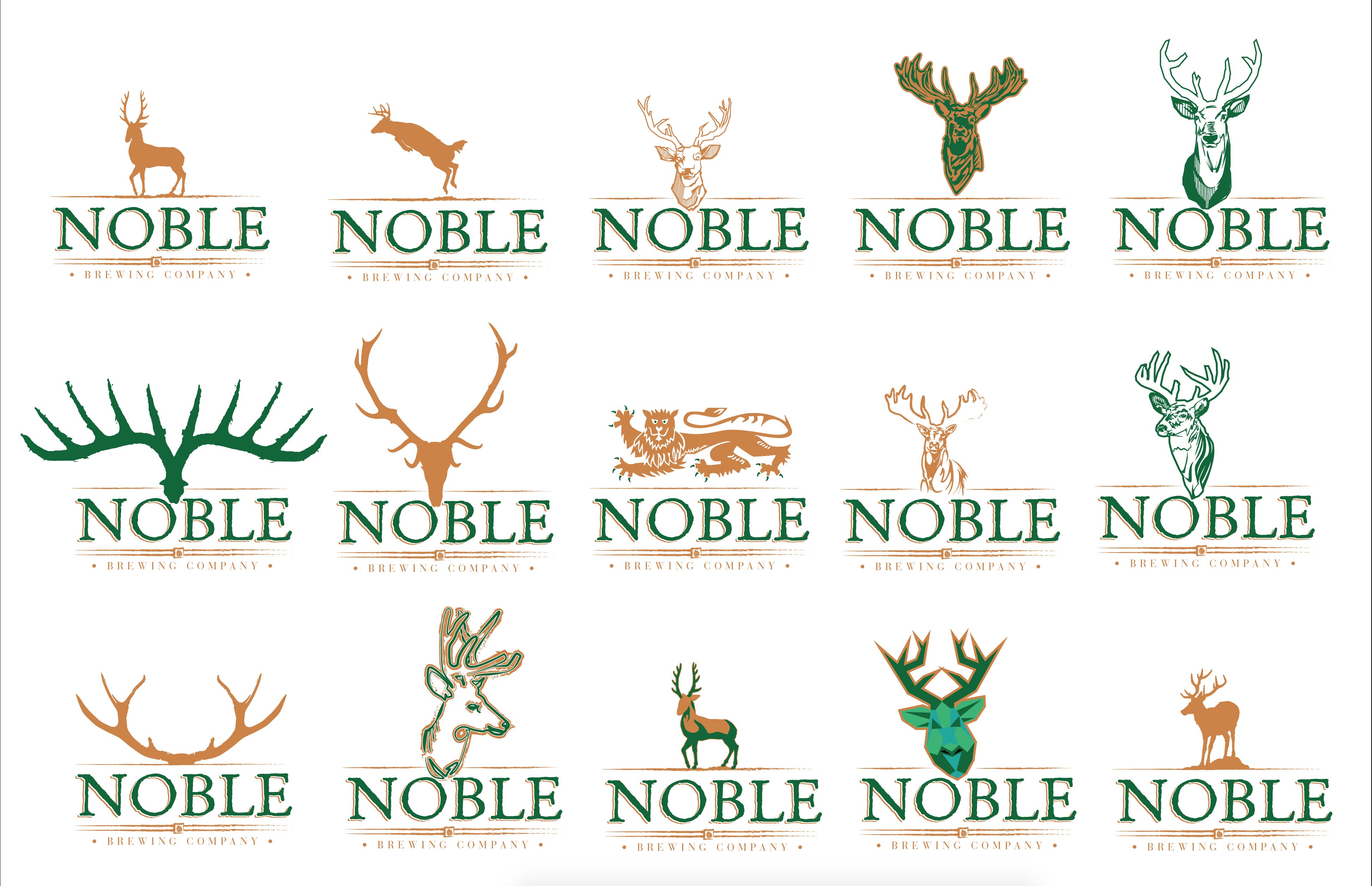
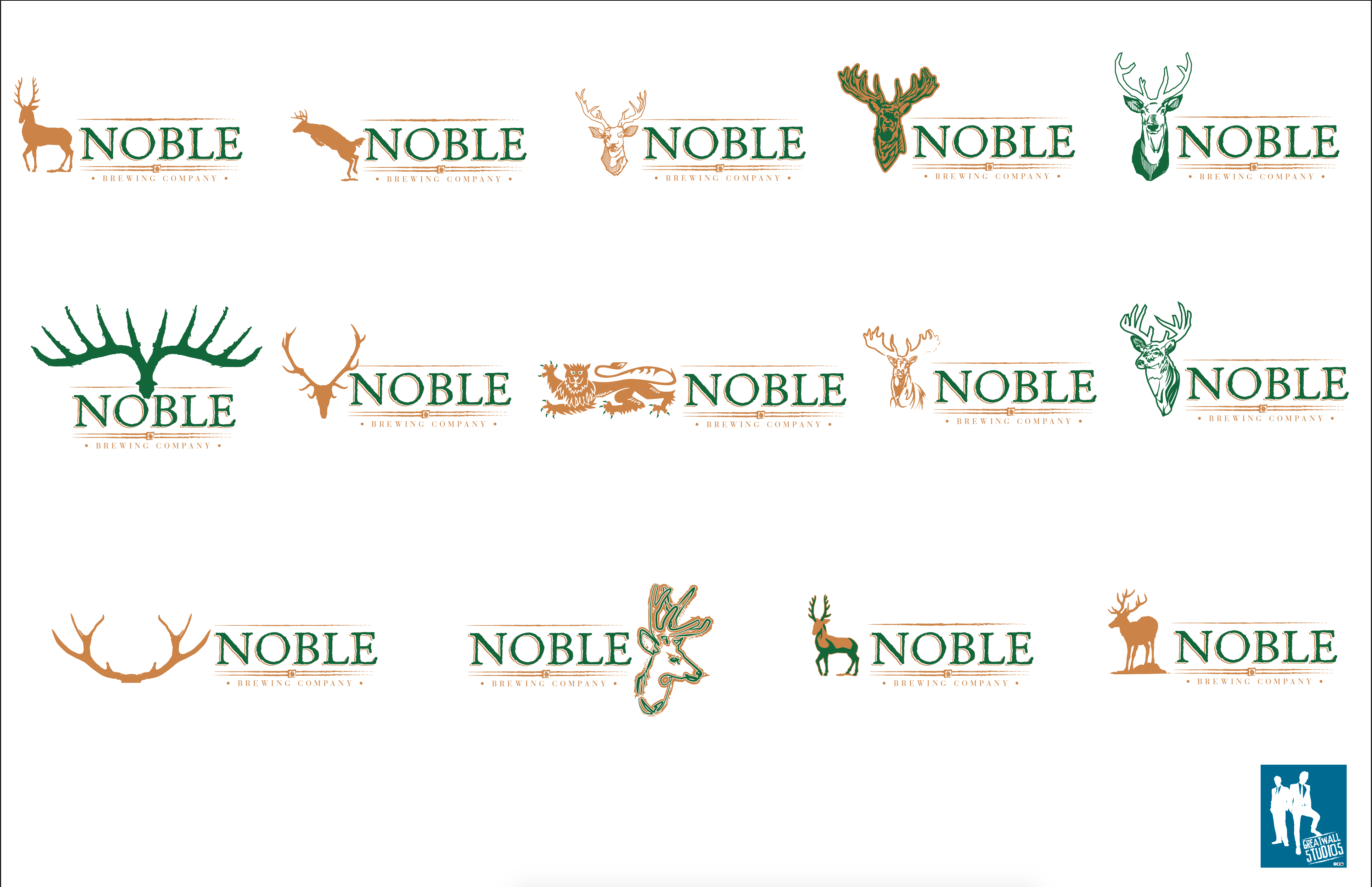
We take those notes and we rework those designs that were greenlit and delete the ones that weren’t. Rinse and repeat for Rd 2 & Rd 3. It’s at this stage where you should find yourself with a finalized logo, and it will then be put through for finishing so that your logo package can be sent to you. Depending on your agreement terms, you may be asked to pay 50% up front and the other 50% 30-60 days after you’ve received the logo package. As a visual representation, please look at Noble v1 – v5.
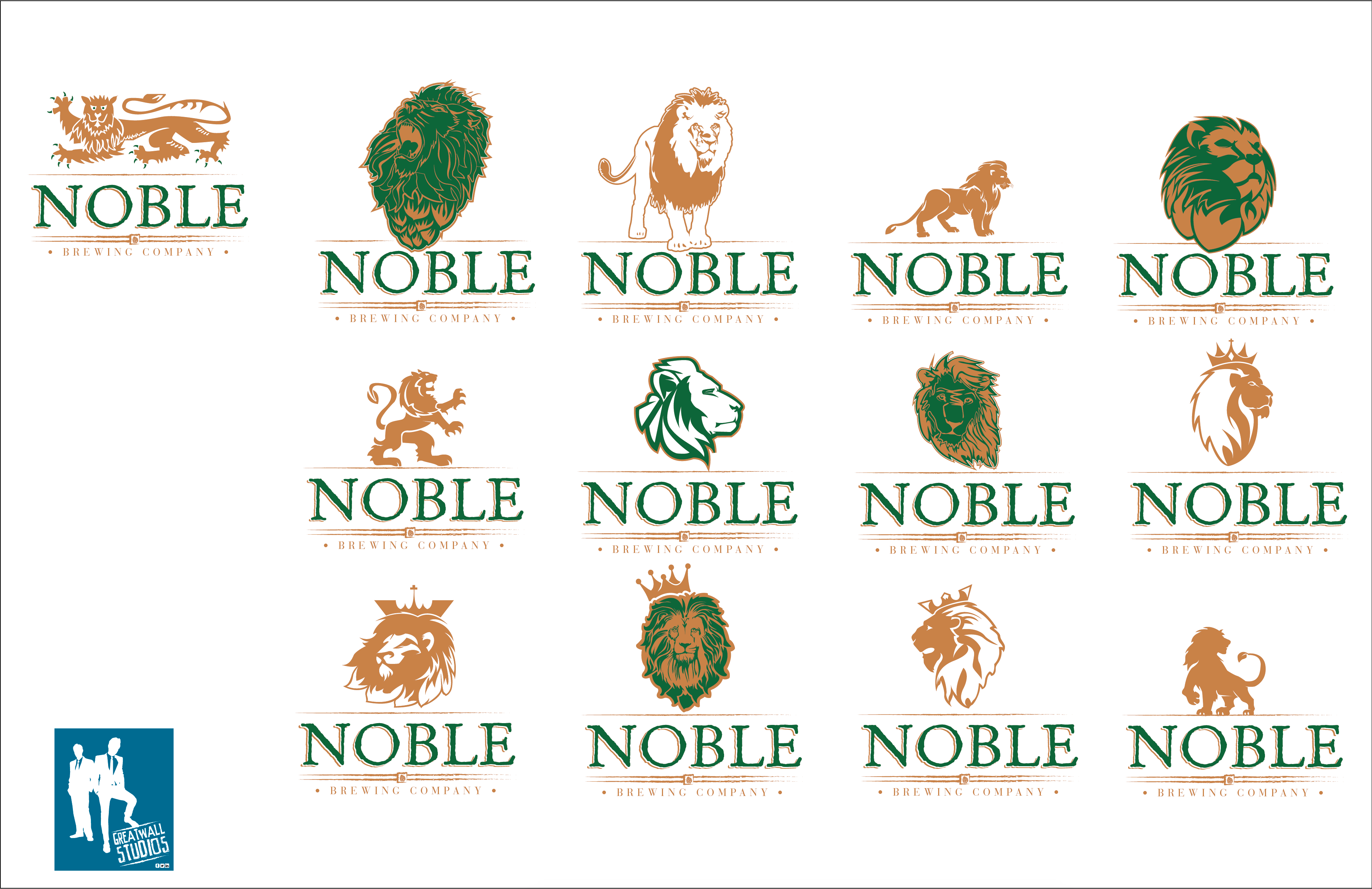
First round of logos based on client provided brief. Using colours and elements that had been specifically requested.Redefining the terms of the logo, making it more Saskatchewan centric.They liked the idea of Saskatchewan colours, but also wished to include a crest / shield to reflect the name “Noble”.Instead of an illustrated shield we made some photorealistic versions in different shapes. Here we explored the Noble word mark with various fonts.The next iteration involved a Noble breed of animal, namely a Stag or Buck.In keeping with the animal theme, a Noble Lion was proposed, and options were explored that we in market to try to narrow down a feel at this point, as we were well into the game, and did not want to lose steam on the project.It was then decided that a combo of Lion and Hop hybrid would be pursued and we did a few that were custom and some that were based off of existing properties to establish what the client was actually after. In the end just the Wordmark was used, with several slashes; one above and two sets below, with an enclosed crown set in the middle.
In our case the logo package usually contains (but is not always) Primary logo, secondary logo, 1 col option, outlined .ai file, live type .ai file, EPS, PDF, PSD, Tiff, Jpeg and png versions of your logos for various applications. We will provide you with appropriate colours in CMYK, RGB, LAB, and Hex Colours if you are also using these designs to update your website.
I hope this has been helpful to you, and is just one small value add we provide to our customers and partners.
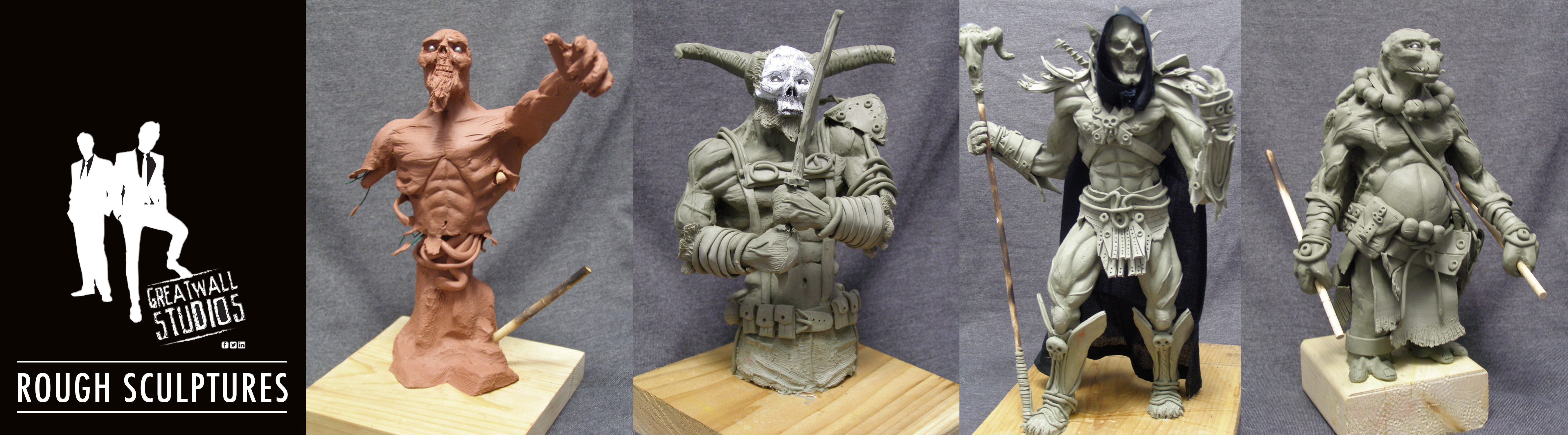
The best part about being a freelancer is that when I have down time, I can pursue some off the beaten path personal art, that doesn’t necessarily coincide with my day job. Although I have done a few renderings of what some labels I have done could have looked like a 355mL cans, mainly what I like to do to fill my time between projects, contracts or obligations in general is to sculpt copies of images I come across on Google, or items that have been sculpted but are priced well out of my price range by groups like Sideshow Collectibles, Jordu Schell, Steve Wang, or Simon Lee.
Since my day job (besides being a stay at home dad) is that of graphic designer / retoucher, I generally enjoy a more traditional medium for a hobby. Getting my hands dirty and pushing clay around feels really great, and is an entirely different set of motions and movements than using a mouse or tablet. I’m not the most talented sculptor, but I genuinely enjoy it, and I plan to carry on for years to come.
This years crop of sculptures. A generic zombie, a warrior, Skeletor® based off of a Sideshow items and an alternate universe Donatello from a picture I found during a Google image search. I did edit the Donatello to make him seem more tribal than the source image.Product line up of brands that didn’t make it passed the label stage.
Realizing that I advertise myself as a graphic designer / production artist, it might seem strange to show work here that is neither of those things. But sometimes, it’s really great to get your hands dirty and feel something come together at your finger tips. I don’t do much painting or drawing anymore, as I’ve really been on a model building and sculpting kick these last few years. So as a healthy way to decompress, and to better myself artistically I dabble in rough maquettes. I definitely prefer Chavant NP Hard plastalina clay. I’ve tried two items in the soft and I am not a fan of the sticky, mushy mess it makes. Seems like it would be great for free wheeling gestural mock ups. But that’s not my style. I’m still working part time as a freelancer and full time care giver to my two year old daughter, so I’m more likely to carve out some time during the week to work on a longer project, rather than bolt down to my office to whip up a 1 hr gestural sculpt. I also don’t have a tonne of space to store these things once I’m done them either.
But it is fun, and I’ve completed four this year, which is a new record. I have plans for one more that is a bit more ambitious. Not in scale / size, but in that it’ll be a dynamic action pose held aloft in the air on pins. I might also see if I can finagle a diorama base into the mix, but we’ll see about that.
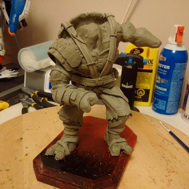
So I realized it had been a while since I last sculpted anything (That item being the torso of Sagat from Street Fighter®) And felt like getting back into it again. I felt as though I learned a fair bit when working on Sagat, so I tried to bring that knowledge over to these new projects. I tackled a newer version of Raphael from TMNT: Out of the shadows. As I had previously tried a version of Raph from the original 2014 movie (or whenever it actually was) that I have posted about before, with a series of images based on the figures progression below. So early in November I began a newer Raphael sculpt based on the movie from this summer and I wasn’t very happy because I made a pretty major error in posing the wire armature early on, and wasn’t able to compensate for it once it was epoxied onto the painted base. I tried to remedy that on a companion piece Leonardo, got the balance right, but ultimately made one leg far too long and out of proportion to the other leg. I really need to go back and spend some time drawing anatomy reference to get better at sculpting it. I bent the armature into position over top of the photo reference I was using, but didn’t account for how much/little I would need to use as a pin by the feet to epoxy into the base. I must have missed a pre-bend mark and used more of the wire in the leg than I had intended. Things to take away from this; Slow down during the armature/posing stage and get the measurements right. Don’t epoxy the armature to the base until after sculpting is done, that will give me a clue as to whether or not I have the subjects balance correct without the base itself carrying more counter balance load than it really should. Mark bend locations clearly.
I have started to use Chavant NSP Hard for sculpting because it’ll take and hold little details rather well. I do like the Medium version as well, not so hard on the fingers if you don’t have the stuff up to working temperature yet. My heat lamp set up is fine, as this obviously isn’t my day job but a fun escapist hobby. I am just having a hard time locating this stuff locally, as it seems both Curry’s and Michael’s don’t carry it any more. Plus they seem to be selling individual 2lb blocks on Amazon.ca for close to $100 which is ridiculous. Amazon.com has it for cheaper, but it’s also in US Dollars, and the shipping / handling and import fees are fairly high. I’ll have to find a local sculpture supply place and see if I can order any within Canada.
Anyway, here are some shots of the newer stuff. Nothing too special. I see the mistakes made, and I look forward to doing more next year. As an update from yesterday, I meant to say that I am really truly impressed by anyone who is able to sculpt a l portrait likeness of another person. I really don’t seem to command the patience to tease out anything the looks close to an actual characters facial features. I almost got semi-close on my Groot sculpt, but in that case I spent more time on the face than the whole rest of the body, extremities and surface details combined. I have also found a Toronto based sculpture supply store that carries Chavant NSP Hard and has reasonable pricing compared to the highway robbery going on over at Amazon.ca.
It’s that time of year again, as the summer days are winding down, and the cooler air settles in, we begin to smell fall in the air! But best of all is the Markham Fair! A great place to go with family and friends, where they have a little bit of everything. It is the kind of spot where they have something for everyone! So this September and October take a memorable trip with the whole family. Get a Blooming Onion, or roasted corn on the cob, candy floss and all the other carnival treats you’ve been dreaming of! Stuff yourself silly with Tiny Toms donuts and visit each of the pavilions to discover something great about old school Canadianna. This year you can even check it out on Instagram, Pinterest, Facebook and Twitter! Come for the monster trucks or Ram Rodeo Tour, and stay for the cooking demos and fireworks every night at dusk. FREE PARKING!
Markham Fairgrounds, 10801 McCowan Rd, Markham, ON L3P 3J3
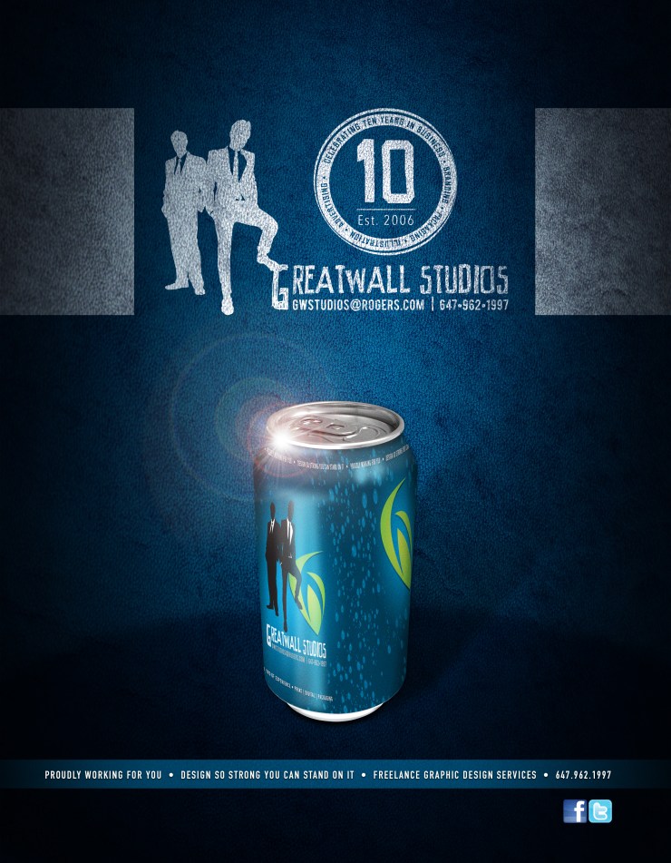
This year we are celebrating our 10th anniversary as a freelance graphic design studio. It has been a fun journey, and I am proud of the clients I have made and kept. Things weren’t always easy, but we’ve managed to keep a toe hold in the marketplace for a while now, and I can only see things getting better and better.
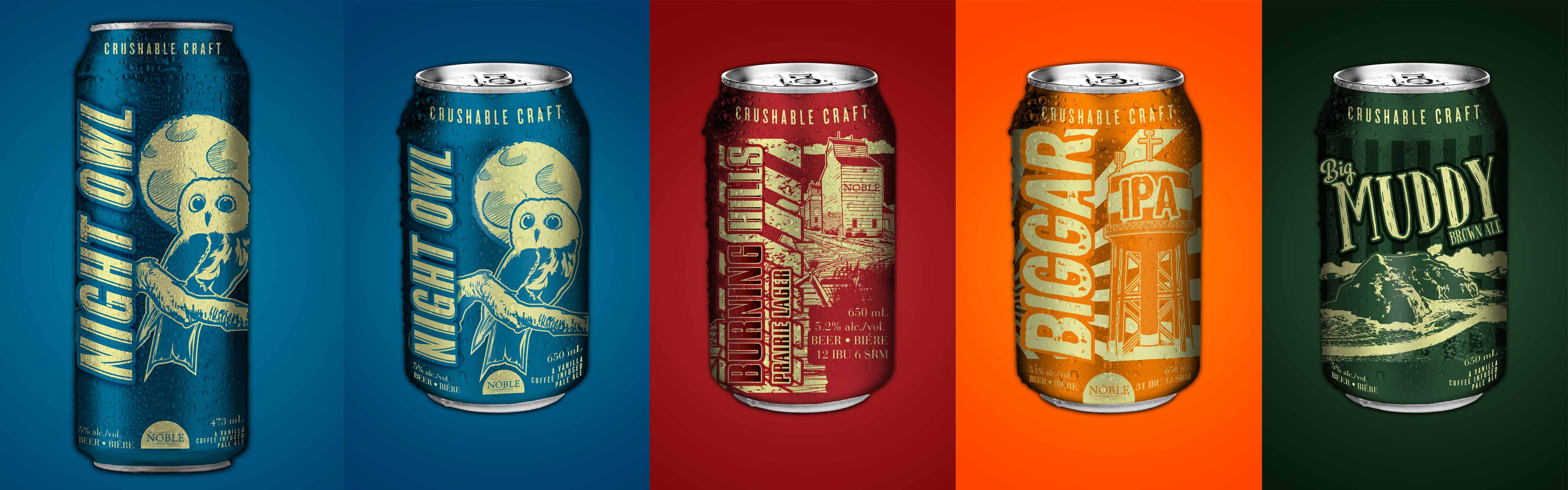
Trying some new art direction styles this year, and breaking into packaging after a whirl wind stint with the good people at Molson-Coors. Taking my love of design, illustration and Photoshop to the masses this year!
Also making the effort to spend more time sculpting, model making, and wood working. Going to bring my creativity level up a notch of two with a wide variety of DIY projects around the house and garage. I also have a good number of items I’m going to produce for my daughter. I currently have a “mini” 4ft Tie Fighter® in the works, which is waiting on a final sanding, prior to painting. That little beast swivels on a lazy Suzanne, has cannons and both wings at an 18″ extension. I am building foam padded seating, and a central console to round out the whole process. The second project is an art hanging station, with router work, and maybe some inlay?, not to sure yet, we’ll see how cold it gets and how long I can work with numb fingers in my cold, cold, cold garage.
Also on the list is a Potato Box for the garden, and some planters for Strawberries and Raspberries. We are looking at a very delicious summer bounty this year if all goes well!
So a warm thanks to everyone I’ve done business with, it is my pleasure. The reward for good work, is more of it! “And that’s a good thing” ~ Martha Stewart.


You must be logged in to post a comment.