I might be behind the eight ball here in terms of knowing about how to turn illustrations of uniquely shaped bottles into fully fledged 3d objects using Photoshop, but learning that work flow and then being able to chuck that stuff into Dimension and creating realistic looking mock ups is astounding. So glad I came across this stuff. No longer do I need to slave away drawing every bend of light or using finicky meshes. No no no, now you can draw up your custom bottle in illustrator, render the 3d shape in photoshop, with separate outer glass, inner liquid fill, cap and cork, plus add your various labels and tie that shit up with a fucking bow in Dimension with lighting effects, camera perspective matching to your background. Dear lord, it’s a game changer! I for one am pumped about what this could do for my beverage, and packaged goods clientele. Mind blown. I am tickled pink. Pleased as punch. Until next time.
Also – side note. I wrote a book of short stories available on Kindle, and kindle unlimited for $.99 USD. The Company – A series of interconnected space short stories by Mark Holyome. Available in 11 markets worldwide.
So over the last few years I have doodled some faux beer brands for shits & giggles to keep busy and sane. Well now I am able to render them most realistically and in about 1/10th of the time my old method took me. Which makes me both happy and excited for the future of my graphic design business. Mock ups won’t eat up endless hours of my day anymore. Wah whooh!
Some samples with and without lighting effects and/or surface effects:
Since I last wrote anything here. Things have been sort of strange. I picked up a new client (which is awesome) and have been pretty busy with design work, even though all of my other clients have had to buckle down and curtail their spending. Plus it has been hot as balls in southern ontario this summer, and we’ve spent many, many hours outside swimming and tending to the farm crops. So much weeding. I am sick to death of weeds. But on the plus side, we’ve made pickles and fresh relish, so Go! Team!
Have a wooden screen door on my work bench, and a few bowls or a vase on the lathe to do before Christmas. Fall is just around the corner, and that brings it’s own wheel barrow full of problems and technical issues we need to solve to stay COVID-19 free. Laundry/showering/disinfecting my school ahed child and teacher wife. We’ve been problem free due to physical distancing, but now that is no longer an option. Lots of lost sleep and stressing as a result.
I hope to be able to write a few more short stories before years end, but I’ll wait until I have something to say, or a new facet to explore in my pre-existing sci-fi universe. Maybe a turn at horror, or all out action, or a real think piece. No idea. Haven’t drawn a single page of my children’s book, but again, not concerned about it at this point.
Perhaps the fall will bring some old clients back into the fold with paid work, or they’ll ramp up in early first quarter of 2021.
Now that I am face to face with nearly 30,000 words worth of short stories to review and correct. I do not have an exceptional grasp of high level grammar, syntax and the like. My writing style is pretty pulpy or plebeian. I did my university papers with the same layman’s appeal that I use today. I think I was accused of using purple prose once so I don’t try to get too flowery or “cerebral”. That’s not who I am. But I digress. Editing, and editors. You must have a fairly wide continuum in the quality of work you see. Although I couldn’t imagine there being too many commercially successful writers whom turn in work that requires too extensive a review. But I don’t know. I’m a graphic designer who also dabbles in sculpture, so my knowledge of the ins and outs of the world of paid writing is woefully underdeveloped. Looking at forty plus pages to go through a few times is more daunting to me than writing anything. Mind you, I write micro short stories, so if I keep it succinct I can probably write four hundred to one thousand words and be happier than a pig in shit. Creating something from nothing is simpler to me, than making sure what is written follows all the appropriate rules of the english language. Kudos to all you editors out there. And to any writer who takes on the task themselves. Brave souls, the lot of you.
That didn’t take long now did it, ha. A few new projects turned up in my inbox and after my daughters play group, and a stint out shopping for groceries, I’m back into the thick of it. Just the kick in the pants I needed to not feel so… well, lost – ish? More like, left to languish in a soft spot between projects and work responsibilities. Floating around with no definite need to really go and get anything concrete done, seems to fit the bill. Although now that I have some deadlines listed in my day planner, I feel a bit more like myself. Don’t get me wrong, I’m a champ when it comes to vegging out, and “doing nothing“. I can fill up the better part of a day with “doing nothing“. No I can’t help you out, or go do something, I’m in the middle of doing nothing. That’s it, that’s the thing. Or now you’d say, that’s it, that’s the tweet. #DoingNothing . But to have a steady work flow that isn’t too manic, or lax is my sweet spot. I love to have work on the go, but with time in between to sculpt, or build model kits, or noodle about on my guitar. Hell, this year I’ll even add starting and completing a children’s book for/about my daughters.
I think my days of working through one hundred plus items per week, for years and years have come to an end. The physical toll, on my wrists, my eye sight, and my general mental state means I’m not exactly itching to go back to that. Working freelance, while it does entail some last minute ditch attempts to get stuff out with insane time lines, usually leaves me with more than enough time to plan out and execute projects with a buffer of time so I’m not run down to the bone.
Oh yeah, I did manage to get to that crazy ass junk drawer yesterday, so I’m having a very productive 2020, for small daily wins. Plus I’m keeping the house just a tiny bit cleaner, and realizing where all of those weird odds and ends have gotten to. It isn’t much, but it’s honest work, as the meme states. Do you find yourself accomplishing the tasks you set out for yourselves, or have you settled back into the usual all ready? For what it’s worth, I’m still drinking plain water every day, I’m not crazy and haven’t gone to only water, but I’ve added it into the mix of beverages I’ll regularly reach for throughout the day, and I think that moderation is key. Same with making a conscience effort to make small, or incremental life style alterations to my day to day habits. Adjust a portion size here, reach for a glass of water there, take some stairs, walk to a store once more than I usually would. Nothing major, and not making myself crazy about it either way. Having to pee several more times per day is not much fun, but clearer skin, fewer headaches, and more regularity are worth a couple added pit stops over the course of my whole day.
Greatwall Studios is a boutique design studio that works with medium to small sized companies across Canada. There are more design firms than I would care to count, so how do we add value to you as the consumer, along with our top notch service? Well, I’ll let you know. Up front, we’ll break down how the process is likely to unfold, and when and where and in what format you can, should or will be required to provide feedback.
A case in point for anyone looking for a logo for a start-up or a mom & pop type business. The first steps we’ll ask you to do is find logos that you are drawn too. Look at other logos that relate to your business, look for any trends or reoccurring graphics & icons. Take some time to think about the colour scheme, as this logo will eventually find its way onto everything. If it is only going to go on a business card, there is minimal risk in having to reprint 1000 business cards if you go off of the design in a year, but if it is going onto uniforms, labels, packaging, vehicle wraps, the side of your building then you absolutely must be certain of the colours you’ve chosen.
Once you’ve done those things, then we would have a meeting and we would discuss the next steps. Discussions regarding your audience or any key demographics you wish to high light or are wary to alienate. We’ll discuss logos that you do like, things that you hate, what makes your company different, what sets you apart. We’ll build a strategy for a collaborative creation of your brands logo.
Then we hit the pavement and do some research of our own. Then comes the thumbnail sketches, where we just play with themes, positioning, font choices, layout, colour and composition are really taken for a spin as we tackle the solution from every angle we can think of. Those thumbnails get narrowed down to a solid set of 7-10 ideas which then get fleshed out in greater detail. This leads to our first round of review. A good rule of thumb to keep in mind is that most agencies will include **3 rounds in the price tag, and anything outside of that and you’ll begin to pay for overages, that will quickly **double if not **triple the original price (Not always the case, but it has been known to happen). This is where you get to hold the designs in your hand for the first time, and really should take a few days to mull things over. Look at what you do like, make notes of it, look at what you don’t like, make notes of that too. But explain it in terms of:
• Colour choices • Icons • Layout • Composition • Fonts & Typefaces • Size of elements contained within design • Is it too minimalist vs. Too busy • Is it cliché • Too similar to something you think you recognize from somewhere else?
These are criticisms that are easily deciphered and can be corrected with ease. Coming back with statements like “I don’t know, it just isn’t working for me. Or, Seems off, it’s weird.” Are comments and criticisms that will cause you aggravation because they don’t identify any portion of the design, and are wholly subjective to you.
So you’ve had a good look at the designs, you and your team have looked them over and argued for and against certain designs. Now you deliver to us your review notes, typed out alongside the logo options, and discussed in person.
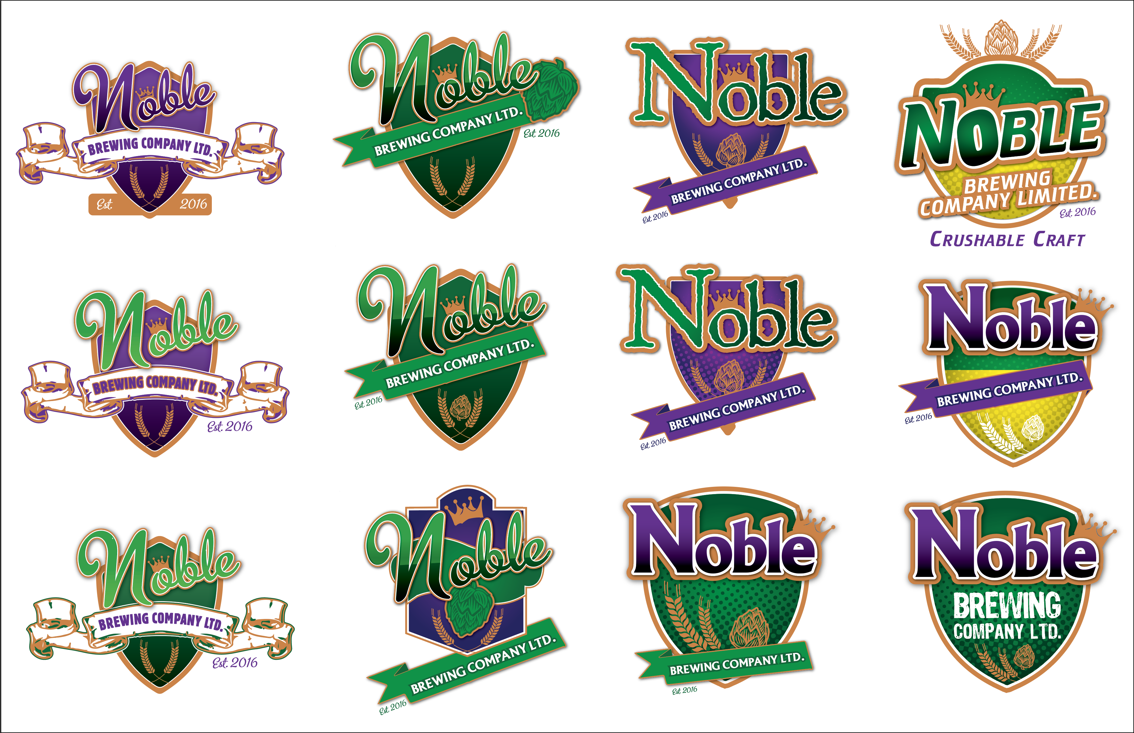
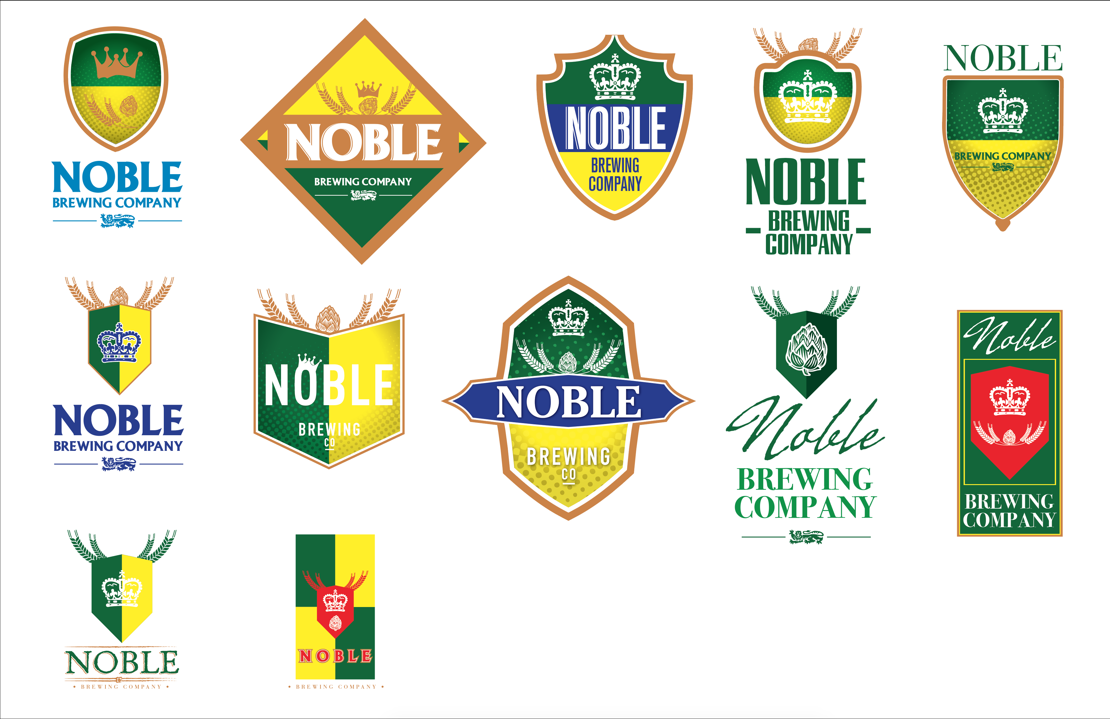
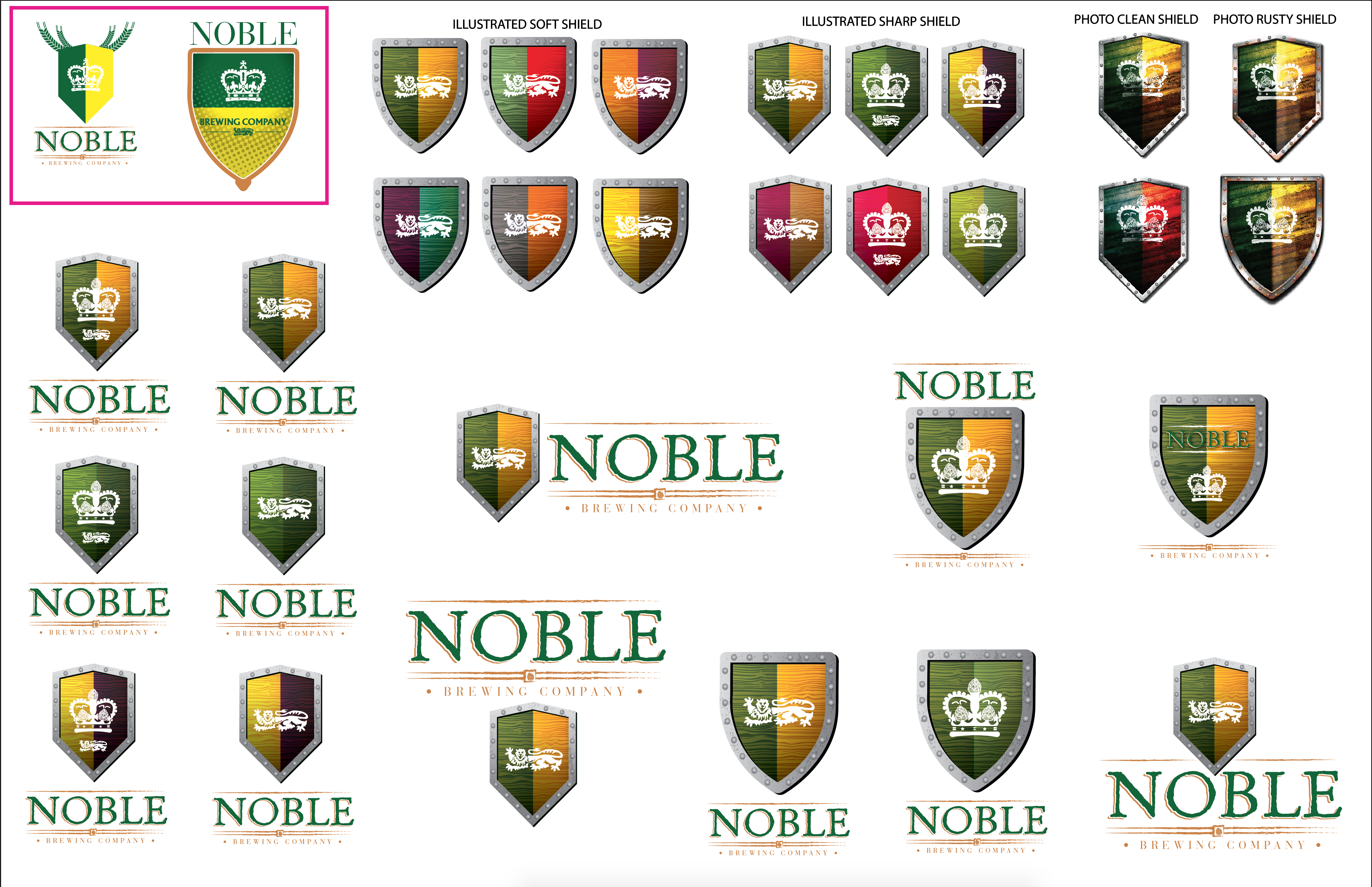
We take those notes and we rework those designs that were greenlit and delete the ones that weren’t. Rinse and repeat for Rd 2 & Rd 3. It’s at this stage where you should find yourself with a finalized logo, and it will then be put through for finishing so that your logo package can be sent to you. Depending on your agreement terms, you may be asked to pay 50% up front and the other 50% 30-60 days after you’ve received the logo package. As a visual representation, please look at Noble v1 – v5.
First round of logos based on client provided brief. Using colours and elements that had been specifically requested.
Redefining the terms of the logo, making it more Saskatchewan centric.
They liked the idea of Saskatchewan colours, but also wished to include a crest / shield to reflect the name “Noble”.
Instead of an illustrated shield we made some photorealistic versions in different shapes. Here we explored the Noble word mark with various fonts.
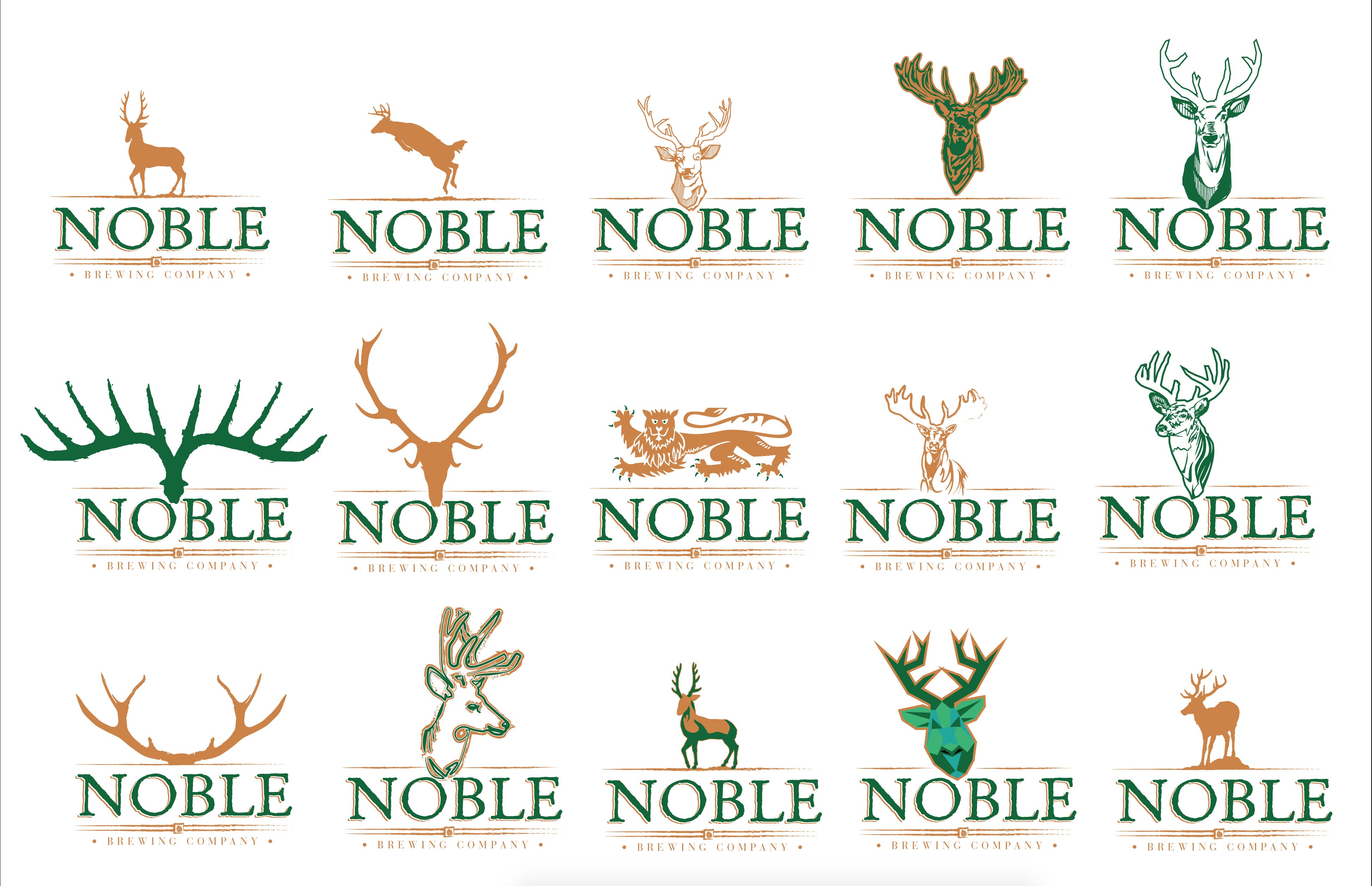
The next iteration involved a Noble breed of animal, namely a Stag or Buck.
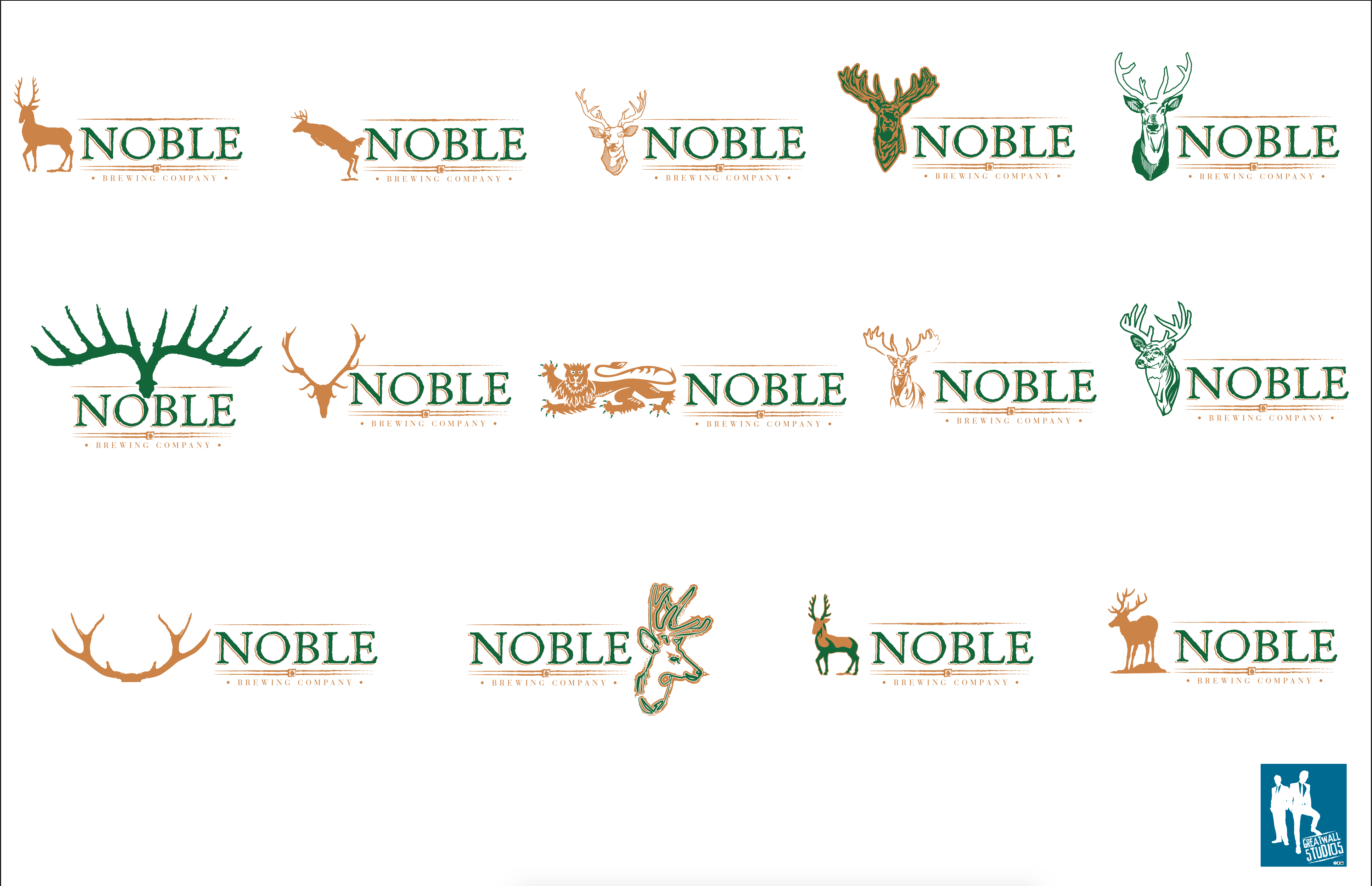
In keeping with the animal theme, a Noble Lion was proposed, and options were explored that we in market to try to narrow down a feel at this point, as we were well into the game, and did not want to lose steam on the project.
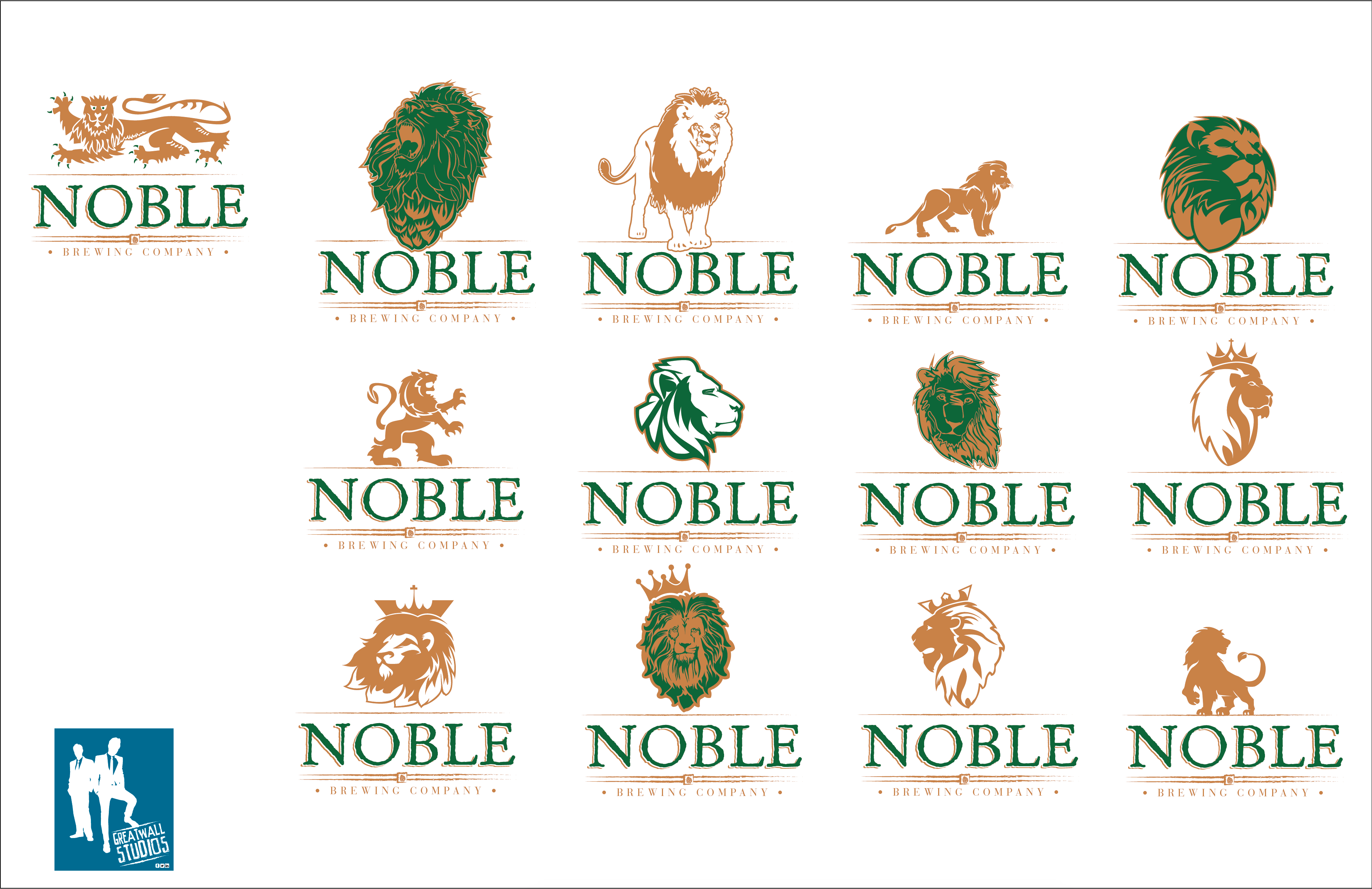
It was then decided that a combo of Lion and Hop hybrid would be pursued and we did a few that were custom and some that were based off of existing properties to establish what the client was actually after. In the end just the Wordmark was used, with several slashes; one above and two sets below, with an enclosed crown set in the middle.
In our case the logo package usually contains (but is not always) Primary logo, secondary logo, 1 col option, outlined .ai file, live type .ai file, EPS, PDF, PSD, Tiff, Jpeg and png versions of your logos for various applications. We will provide you with appropriate colours in CMYK, RGB, LAB, and Hex Colours if you are also using these designs to update your website.
I hope this has been helpful to you, and is just one small value add we provide to our customers and partners.
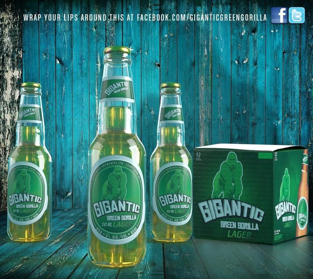
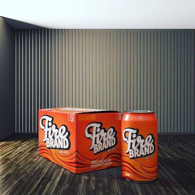
They say the secret to success is not waiting for good things to happen to you, but to go out there and make things happen for yourself. In light of this fact, I have taken the last few rather slow weeks, to produce a nice back catalogue of #fictionalbeerbrands to pull out of my back pocket in case I land a short order alcoholic beverage packaging concept job. I started off with ten 12 pack bottle cartons, mostly done with Illustrations rather than go my usual route, which would focus heavily on Photoshopped composites. Not that I have anything against that sort of thing, I love it, but what I am trying to do is show range. You can only show range, by getting out of your comfort zone and trying something new and different. Below I will post all ten, plus two more items, which are 24 bottle cartons, that are recreations of a brand from my past. #Packaging isn’t my primary focus, but it has become a vehicle for concept ideation, which is something I now really, really enjoy. My first love will always be print advertising, and using Photoshop, heavily. I might take these items a step further and complete some 3D renders of them, and make the companion bottle and a line extension into 355mL or 12 Fl. Oz cans.
This slideshow requires JavaScript.
Should you like the look of any of these, or wish to pursue some options for your own brewery please feel free to reach out to me at: gwstudios@rogers.com
So here we are a couple of days in and two of my family’s birthdays are done and accounted for. The final projects of 2015 have been all wrapped up, and the Christmas decorations have been packed up and put away carefully for another year. Now, since it is the last day of the Christmas holidays before reality is due to kick back in, we turn our attention to Monday. Seeing as how I am self employed, and I don’t pay to advertise, and work primarily off of people I knew from previous jobs, and the associated connections I made, I feel it is worthwhile to once again let you all know what is available to you from my Graphic Design business GreatWall Studios: Graphic Design.
In my LinkedIn profile, you’ll notice that I have worked most ardently in the Beer (alcoholic) beverage industry. I will now name drop the breweries and companies I have done design work for : Evolution Design works, Molson-Coors, Moosehead Breweries Ltd, The Boston Beer Company, The Twisted Tea Brewing Co, The Bruce Ashley Group, the C & C Group, Heineken, Dos Equis, Creemore Springs, Estrella Damm, Shepherd Neame, Paulaner, Hop City Brewing Co, Mill Street Brewing, Rickard’s and Boris Beer to name the largest portion. For these companies I have created can and box packaging, logos, design and layout of copious sell sheets and ppt templates, apparel, and retail displays. Working with so many different brands, I am well aware of possible restrictions via Brand Standards and Guidelines.
I also have production experience, where having a creative eye can make the transition of your product from one size packaging to another that much smoother, as I am paying attention to not only the legal requirements but to the overall composition of the piece.
I also am available to do concept work for packaging; anything from cellophane bread wrappers, pet food packets, to beer cans & bottles, and their associated labels, cartons and trays.
I am also able to produce 3D carton renders, and bottle and can renderings.
I am also available to produce Catalogues, (of various lengths), and Flyers, Posters/Infographics, Logos, Print Ads, Web Banner Ads (Static & Animated), Fleet Graphics and Vehicle Wraps, Illustrations and Photoshop Composites.
I however don’t do back end web development, and I do very little multi-media (video editing) at this time. I did six or seven “Win a Grand A Day” video spots for Moose Light in late 2014, set to music, with pop up text and that was that.
I work with companies from both the East and West coast, so I am very comfortable working via e-mail, telephone or video conference calls.
A few weeks ago; October 6th, 2013, I reached a bench mark at my current position that I initially didn’t think was possible. I have been a full time graphic designer for Moosehead Breweries Limited | The Premium Beer Company for five years and counting. This is something I consider to be an achievement, for a few reasons. The first being a rather funny anecdotal experience.
When I first interviewed here back in September of 2008, I met with two Marketing professionals who were looking to begin a pilot project for bringing in as much design work in-house as they could, as a cost savings measure, and as a way to ensure more overall cohesion in the materials being created. (**Both marketers and the VP at the time are now no longer with the company). During the last portion of the interview process I met with the VP of marketing here and the first words out of his mouth were “You know Marketing is a tough business, there can be a lot of turn around, two years is a long time here”. Two years? I thought to myself, that isn’t a very long time to drop what I am doing and come aboard here, only to have to continue the job search 24 months later, if that. But I was young, and hopeful and was thinking about time in traditional terms, not Marketing Department terms. After a few weeks in, I came to understand that in fact two years was a long time, and in agency terms it was a lifetime.
We’ve managed to cover an awful lot of ground at Moosehead. Being the entirety of the Art dept for 3.5 years was a tough, but ultimately fulfilling task.Since then I’ve managed to grow the dept by one, and added in an alternating GD internship which is open to college applicants in southern Ontario. As a unit we cover all of Canada, the United States, and a few far flung points around the globe (mainly Singapore, the UK, and South America). We’ve tackled everything from Billboards and fleet graphics, to labels and cartons, to story boarding web commercials and event video loops down to customizable POS items for accounts across the country.
So many great people have passed through here, and I’ve collaborated on some really wonderful projects and brands. I’ve learned so much, and have been afforded a chance to break new ground and test ideas of my own. I’m thankful for the 5 years I’ve had, and I look forward to as many more!
Cheers!
4667 note worthy projects and counting as of Nov 4th, 2013.
Some days this ingenious song lyric (Chris Cornell via Soundgarden) is how I feel about finding inspiration for new projects. As I have mentioned in previous posts, my day job, and one of my hobby’s is graphic design.
Now that’s a pretty big umbrella statement, as (GD) has a multitude of facets, and I am hardly a guru in all of them. Like they say, a jack of all trades is a master of none, so I’ve had to pull back on my desire to learn something useful about every single facet of graphic design and focus instead on a core group of skills that are near and dear to me. But at its heart, (GD) is still about producing artwork, perhaps not “Art” but commercial art nonetheless. No matter how hard I try I don’t ever feel like an artiste. Even though I make 100% of my living off of producing quality images, logos, compositions, type set pages etc etc… To me I don’t feel like an artist. I may well be more artistic than the average bear, but I don’t dress all in black, nor do I walk about covered in paint/ink/chalk, nor do I wear a beret or act particularly bohemian. (I know that is a fairly stereotypical account of what an artiste is, but it’s a hard image to break inside my own head). I’m also a pretty shallow person (in mind set) I’m not all that concerned with symbolism, reading between the lines, undertones or subtext. I’m… for lack of a better turn of phrase; blunt. Like a grey cinderblock. Perhaps because I have eschewed the preposterousness of pretension I feel like I’m not an artist. I also have very little creative control over the substance of what I produce, except for where the item(s) are for myself. Artistic integrity is a luxury I can’t afford at this stage. Not to say that some things don’t rankle my bones, and make me spitting mad, but my job is to produce what others have asked for, in the format they have asked for it. Perhaps those high level agency types know what it is like to be able to walk away from a project over “creative differences” or “artistic integrity”. I don’t quite have the weight to throw around like that just yet.
Back to my main point, which is, searching for and finding inspiration. A real creative spark. I personally have no formula to follow, no checklist to run down in order to find that spark of life which will turn an average idea into something that really gets people talking, or creates a very visceral response. I am not even all that superstitious, so I don’t have the luck to believe that wearing the same socks, or hat or sitting in the same chair will bring that feeling back. So some times that fabulous little spark finds me, and some times I do what I can without it.
So then, what does searching with your good eye closed mean? I don’t actually try to look at stuff with my eyes closed, that’s preposterous… well unless it was a tactile object meant to be experienced, touched, interacted with, rather than just observed… but you hardly close your eyes and touch a poster (scratch & sniff excepted here). It is a whole lot like reading a page while not paying attention to it. Your brain is reading the items, but the words flow in one eye and out the other (I almost said in one eye and out your mother, but that’s another Soundgarden inside joke). You sort of know you read the words but you didn’t take in all in, you just weren’t all that present while you read it. You were on a sort of distracted auto-pilot. Then you have to go back and actually re-read it again (This idea isn’t new, by any means. Any sociology text book or phycology text will have a far better explanation of this than I will ever put down in words.) But what I mean is, there are a whole lot of times when I am searching for inspiration under time constraints, and rather than soak up the nuances of the research materials I’ve gathered for a project, I’m glossing over them and missing that … that, I don’t know, just that “THING” that jumps out at you, akin to a mental domino in your brain that falls against something else and begins to snowball and before you know it your synapses are firing like mad and a picture is forming in your head, and you just start pouring work out onto the page. That excited rush of ideas crashing over you in waves, some of them so fast and furious you don’t even have the time to get them out onto the page before they have slipped out of reach again, but you have flashes of them still, which you cling to and work off of. If I’m lucky a few of those little snippets are enough to bring the idea back into my conscience thought as a whole idea and I can take it even further. Other times I’m left with parts of a good idea, but have to really work to unify them, or pull them apart and use them piece-meal elsewhere.
In order to be (oh god, I am going to say this, Ugh) “open” to finding inspiration, I need to really take the time to look, and see what is in front of me. Not just view it absently, but really take the precious time to not watch the clock, not be consumed by the deadline, and just look, think and brainstorm. Sounds really hokey, and wishy-washy I’m sure. But it happens to me, I get so tied up in the technical details that I don’t take the much needed time to really look and see. I have to just keep reminding myself to come back to it with fresh eyes, and positive outlook.
But, you say, even when I have the time and am really aware of myself and my subject matter, there is no guarantee that I will find the inspiration I seek. Yes, sadly that is true. I have no real insight into helping anyone else with this same issue. But perhaps you are taking a breather right now while reading this. That might be all the help you need.
I always feel just a little bit better after putting things down on paper.


You must be logged in to post a comment.